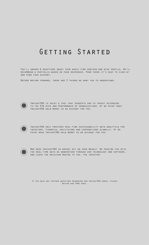
CASE STUDY 1
Automated Investment Advisory Service
Insight 360
Out of the box User Experience vision:
I always like to start with a fresh "out of the box" approach before going into the core of the problem. Sometimes this process sparks new ideas toward innovation and informs unique problem solving pathways.
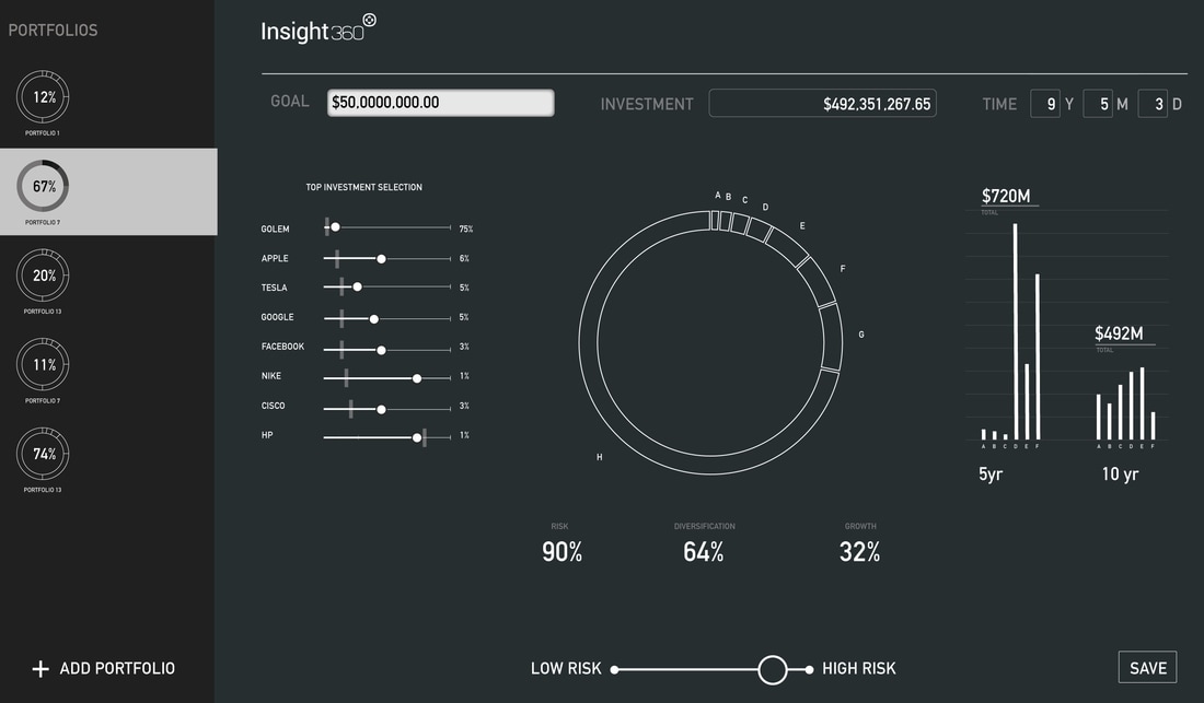
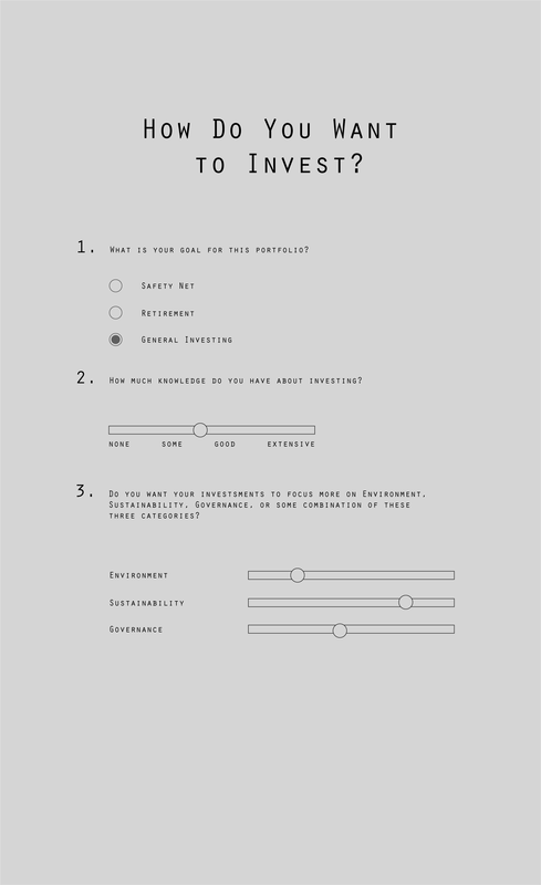
For this particular case, what intrigued me was to think about re-inventing the user "get started" experience. In 2015 several investment firms adopted successfully innovative approaches to recommend portfolios through the use of intelligent advisory services including Wealthfront, Charles Schwab and Betterment. I imagined that Insight 360 could also take advantage of these intriguing tools for its clients and users. In this spirit users will have open access directly from the website's landing page to a sophisticated AI system that automatically generates portfolios with quick custom configurations.
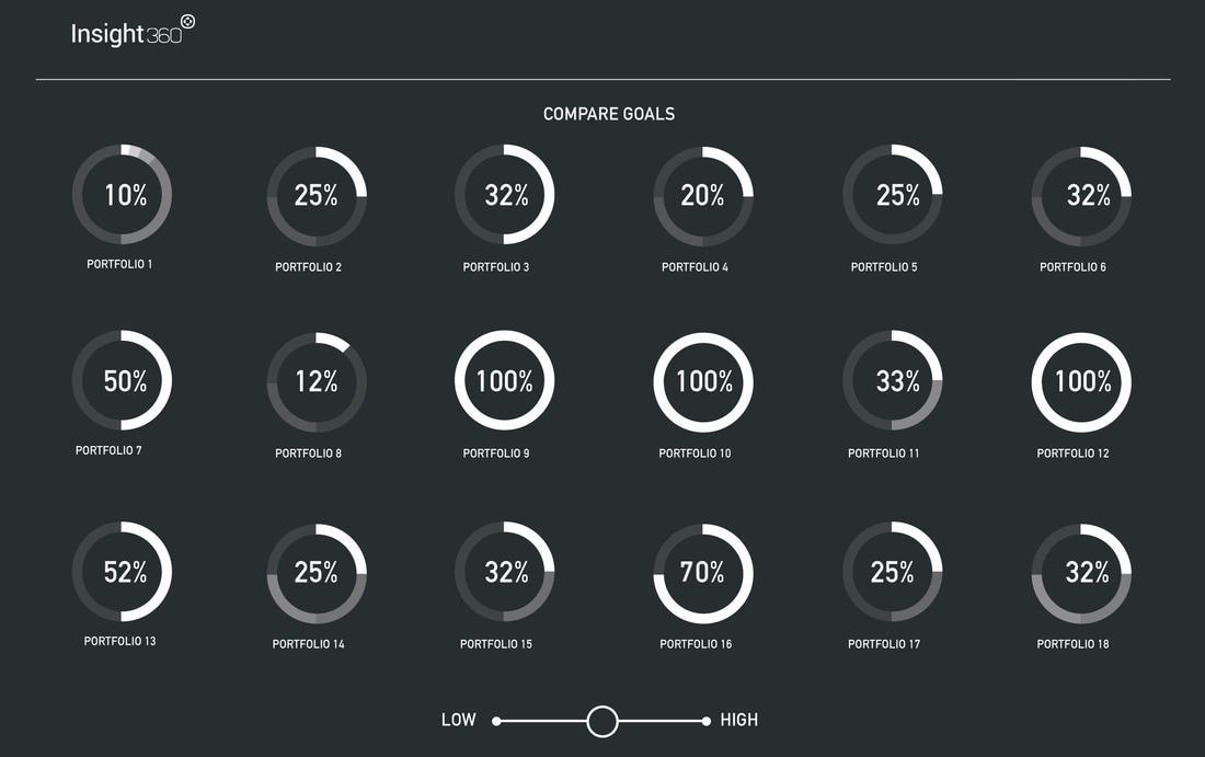
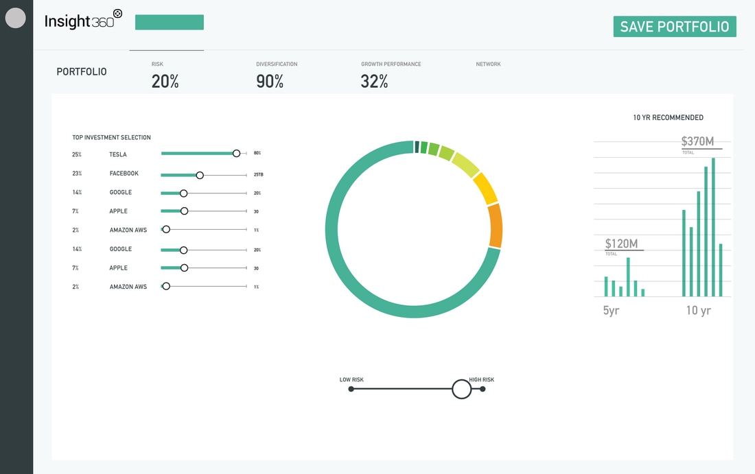
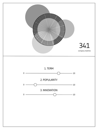
Users, in a few clicks, could visualize & compare portfolios according to ESG and Sustainability values and other trends generated by Insight 360. Furthermore investors could fine tune each portfolio configuration according to their risk comfort zone using simple sliders and intuitive data visualization comparison tools. They would be able to easily identify and save different scenarios according to preferred investment goals.
Design Challenge:
Quick research:
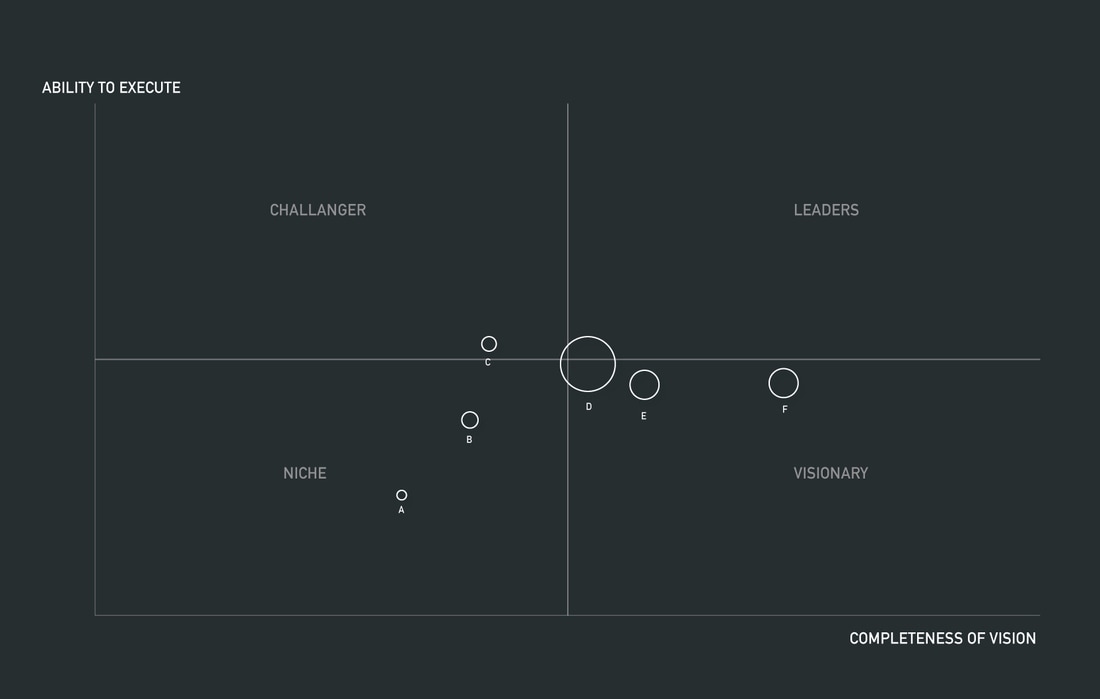
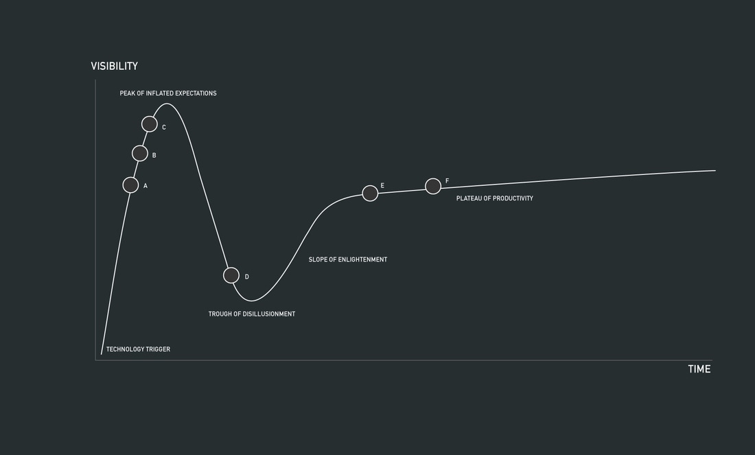
In order to analyze coherently the data and the data framework to be utilized I consulted with a data scientist. We went through the dataset provided and plotted a set of configurations to discover the narrative inside the data. Some of the plots have revealed interesting patterns that validated our assumption that non-linear qualitative visual reports would help in exploring new narratives in the data (i.e. Hype trends and quadrants). We also realized that it would be interesting to support these qualitative findings using quantitative analysis visualizations such as a loess curve fit.
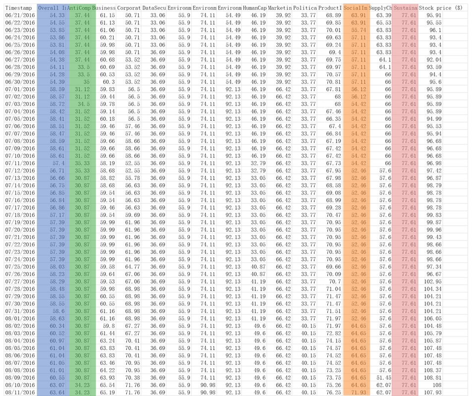
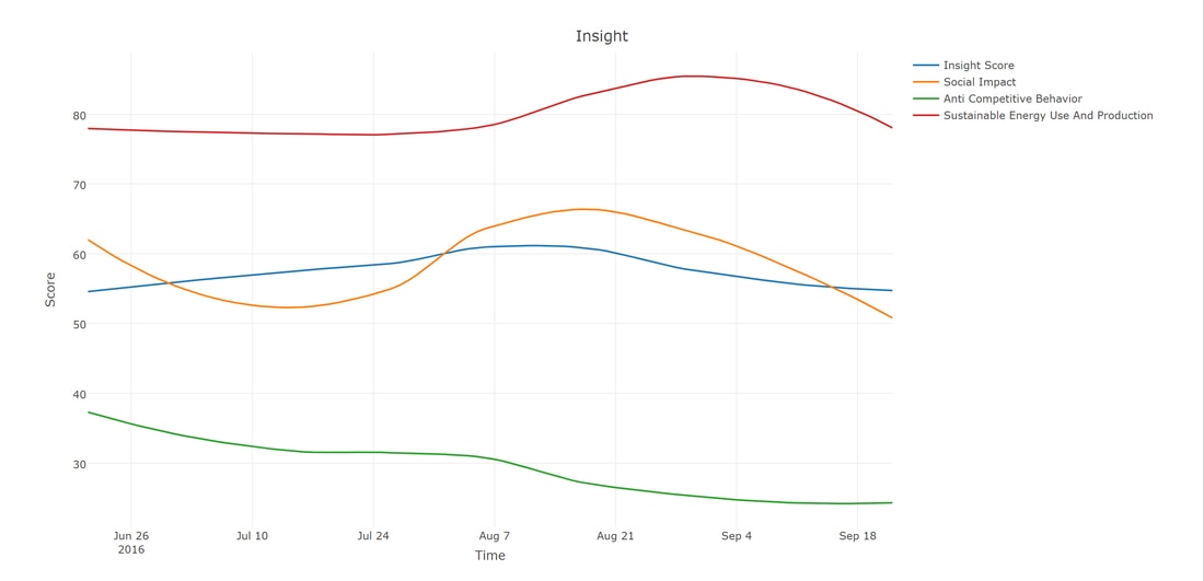
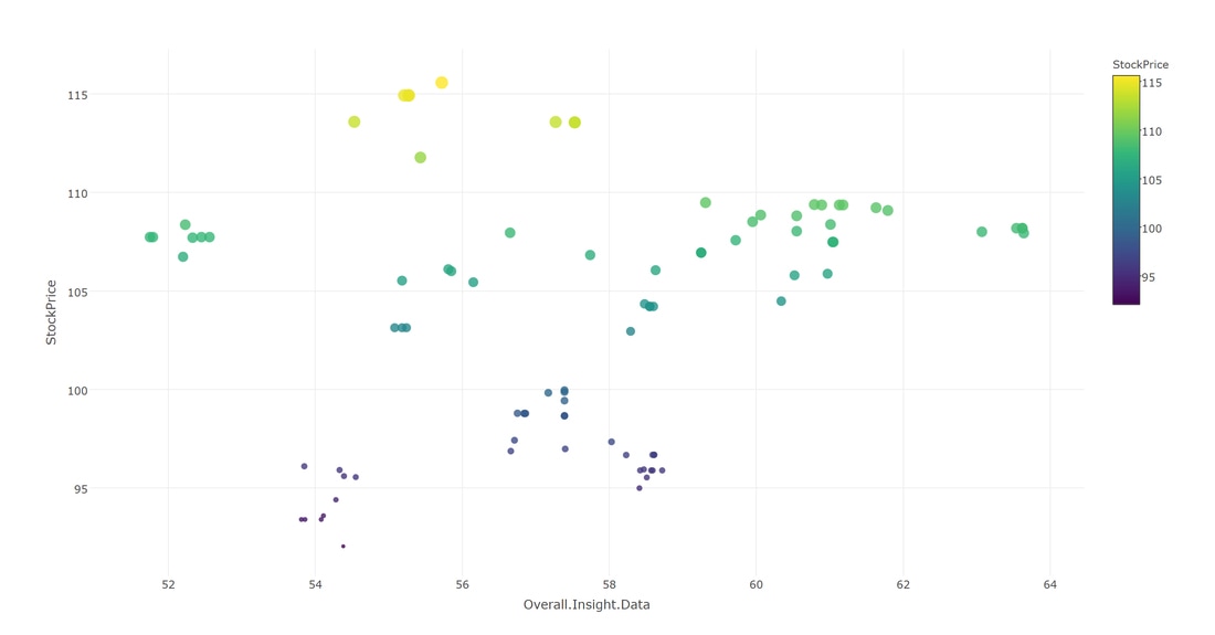
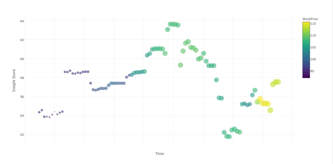
Four columns from the table of data provided were highlighted (Graph 1) and an inline comparison of the general insight score with the other ESG categories (Graph 2) has been plotted using R and Plotly. In a second iteration Stock price (y axis) was plotted as a function of Insight Score (x axis) ( Graph 3) . The 'aha' moment arrived when the insight score was plotted over time, returning an a interesting pattern ( Graph 4) similar to the market trend research report known as the Hype cycle (Graph 5)
Short research conclusions:
It would be interesting to compare company ESG performance against relevant benchmarks ( Including Stock Price, S&P 500, Dow Jones, etc. ) using semi-quantitative report graphs. These benchmarks are familiar to users and considered indicative of market performance. In particular I am referring to research graphs methodologies such as the "magic quadrant" and the "Hype Cycle". I found these visual reports really useful to validate quantitative analysis, and that can be used in addition to other Insight inline components plotted over time, including the smooth loess fit. Because of their nature of reinforcing the assumptions with clear statements I found it fascinating to mix inline quantitative visualizations with non linear visualizations . The practice of comparing not only quantitative information but also qualitative reports can be really meaningful in the process of helping financial analysts' decision making.
Insight score data considerations:
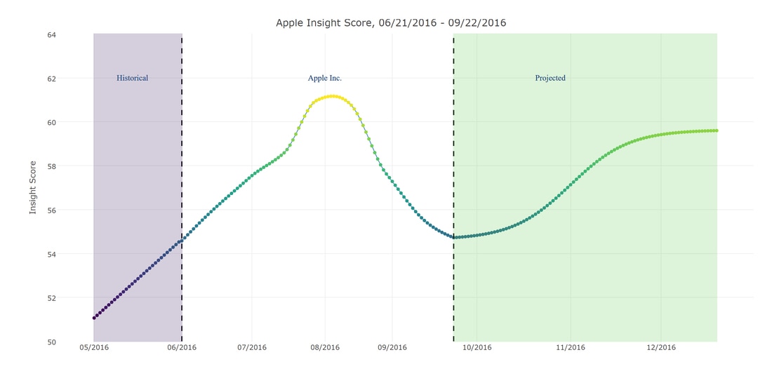
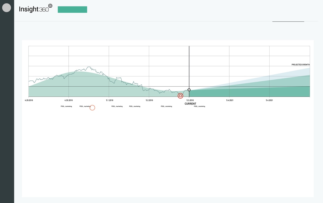
There were two major consideration from the data scientist's point of view. The first is that Insight Score over time steadily increases reaching a peak when all components (Social Impact, Corporate Governance, etc.) are maximized. On the other hand, Insight score declines momentarily as company costs to maintain maximized ESG rise, and may increase asymptotically towards an upper limit of sustainability. This analysis was supported by the data scientist with the strong caveat that the data set provided was extremely limited (i.e., only three months of data), and Graph 5 is mainly for demonstration purposes. With more data over longer periods of time, we will be able to draw more accurate conclusions . One interesting outcome is to plot a yearly ESG index that can be use as a yearly benchmark for investment to evaluate the risk of the most relevant positions in the portfolio.
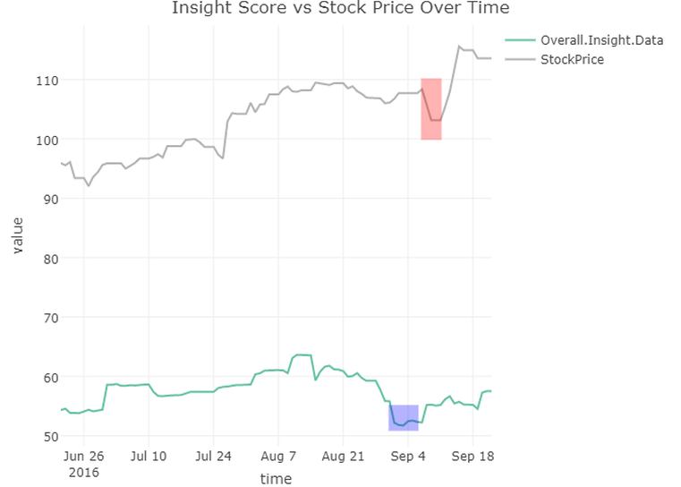
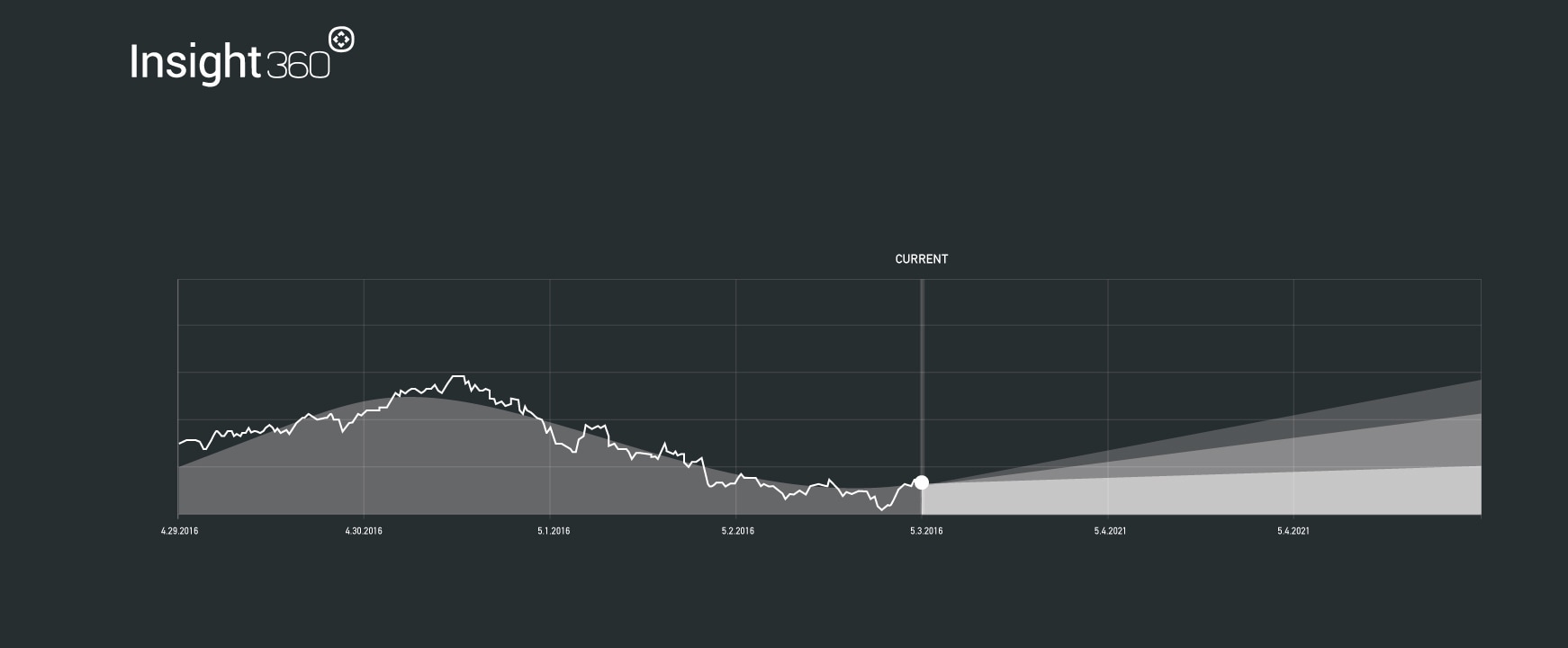
The second consideration is to look at how Insight Score predicts future drops (or gains) in stock price (or other relevant benchmarks). Again, using limited data we were able to find some correlations in these two metrics, where a drop in Insight Score was followed by an immediate drop in Stock price. See Insight Score vs Stock Price Over Time below.
Design Considerations:
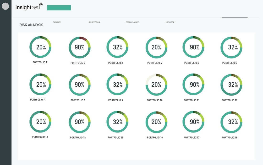
Insight’s objective is not to tell Investors how to utilize Insight score for forecasting, nor is it to categorize the class of investment for the financial analyst. Investment consideration instead could be inferred by design from a set of predictive analytic visualizations . Insight 360 provides a summary metric of sustainable assets with the goal of presenting the data in a neutral way to the investors so that they make their own assumption without being influenced by the financial analyst. If the portfolio is displayed as a trend over time associated with the ESG categories, the Analyst could quickly assess risk and opportunities withing the ESG context for each company or groups of companies. The analyst can present the findings in the form of proximity performance that is more intuitive than analyzing pure values in a comparative inline graph. These kind of visualizations suggest a stronger message without impacting neutrality of the data; each investor would benchmark risk & opportunities considering their purpose and not the pure values. This visual system could eventually provide a more holistic insight of what is the intrinsic purpose of the investors and potentially the analyst while accelerating interest for the tools itself.
Here are some initial design thoughts for compare functionality and chart design ( In collaboration with the data scientist):
Quick research:
In order to analyze coherently the data and the data framework to be utilized I consulted with a data scientist. We went through the dataset provided and plotted a set of configurations to discover the narrative inside the data. Some of the plots have revealed interesting patterns that validated our assumption that non-linear qualitative visual reports would help in exploring new narratives in the data (i.e. Hype trends and quadrants). We also realized that it would be interesting to support these qualitative findings using quantitative analysis visualizations such as a loess curve fit.
Four columns from the table of data provided were highlighted (Graph 1) and an inline comparison of the general insight score with the other ESG categories (Graph 2) has been plotted using R and Plotly. In a second iteration Stock price (y axis) was plotted as a function of Insight Score (x axis) ( Graph 3) . The 'aha' moment arrived when the insight score was plotted over time, returning an a interesting pattern ( Graph 4) similar to the market trend research report known as the Hype cycle (Graph 5)
Short research conclusions:
It would be interesting to compare company ESG performance against relevant benchmarks ( Including Stock Price, S&P 500, Dow Jones, etc. ) using semi-quantitative report graphs. These benchmarks are familiar to users and considered indicative of market performance. In particular I am referring to research graphs methodologies such as the "magic quadrant" and the "Hype Cycle". I found these visual reports really useful to validate quantitative analysis, and that can be used in addition to other Insight inline components plotted over time, including the smooth loess fit. Because of their nature of reinforcing the assumptions with clear statements I found it fascinating to mix inline quantitative visualizations with non linear visualizations . The practice of comparing not only quantitative information but also qualitative reports can be really meaningful in the process of helping financial analysts' decision making.
Insight score data considerations:
There were two major consideration from the data scientist's point of view. The first is that Insight Score over time steadily increases reaching a peak when all components (Social Impact, Corporate Governance, etc.) are maximized. On the other hand, Insight score declines momentarily as company costs to maintain maximized ESG rise, and may increase asymptotically towards an upper limit of sustainability. This analysis was supported by the data scientist with the strong caveat that the data set provided was extremely limited (i.e., only three months of data), and Graph 5 is mainly for demonstration purposes. With more data over longer periods of time, we will be able to draw more accurate conclusions . One interesting outcome is to plot a yearly ESG index that can be use as a yearly benchmark for investment to evaluate the risk of the most relevant positions in the portfolio.
The second consideration is to look at how Insight Score predicts future drops (or gains) in stock price (or other relevant benchmarks). Again, using limited data we were able to find some correlations in these two metrics, where a drop in Insight Score was followed by an immediate drop in Stock price. See Insight Score vs Stock Price Over Time below.
Design Considerations:
Insight’s objective is not to tell Investors how to utilize Insight score for forecasting, nor is it to categorize the class of investment for the financial analyst. Investment consideration instead could be inferred by design from a set of predictive analytic visualizations . Insight 360 provides a summary metric of sustainable assets with the goal of presenting the data in a neutral way to the investors so that they make their own assumption without being influenced by the financial analyst. If the portfolio is displayed as a trend over time associated with the ESG categories, the Analyst could quickly assess risk and opportunities withing the ESG context for each company or groups of companies. The analyst can present the findings in the form of proximity performance that is more intuitive than analyzing pure values in a comparative inline graph. These kind of visualizations suggest a stronger message without impacting neutrality of the data; each investor would benchmark risk & opportunities considering their purpose and not the pure values. This visual system could eventually provide a more holistic insight of what is the intrinsic purpose of the investors and potentially the analyst while accelerating interest for the tools itself.
Here are some initial design thoughts for compare functionality and chart design ( In collaboration with the data scientist):
- Create a historical tool or platform for analyzing usefulness of the Insight Score - i.e. what does an Insight Score today tell you about stock prices tomorrow - let investors or companies look at their historical trends over time through a user friendly tool.
- Investors don’t necessarily need REAL TIME Insight Scores, they want to know what do I invest in TODAY or in one month or one year, etc)
- The insight scores (or at least the data that goes into them) don’t change that much. Some are just flat lines over months. So the focus on Real Time is not enough.
- It does not seem that the Insight score shifts so much day to day, but it does change. In any case, the investor needs to know why this score is important to them.
- There should be a tool that shows how historical Insight scores predict future gains.
- Does a drop in Insight score predict a drop in stock price ? (actually looking at the apple data, we see a dip in Insight score right before - Between Sept 1-6 there is a dip in the insight score, then on Sept 7th stock prices drop as well.)
- please check the simple quick plot thrown together below:
Quick Design Conclusions:
- if we want investors to do what they want with Insight data, then in addition to the score it would be useful to provide them all of the components of the score so that they could decide what was relevant to them.
- We should definitely develop a package ( if it doesn't exist yet) for investors that leverages company Insight scores against each other during the creation of a portfolio ( Portfolio recommendation ). For example, if one company has high score in Sector A, low in Sector B, add another company that is High in Sector B.
Graph 1
(Graph 2)
(Graph 3) Plot of Insight Score vs Stock Price
(Graph 4) Plot of Insight Score over time, colored by Stock Price (darker indicates lower stock price)
(Graph 5) The plot shows a loess curve fit (Local Polynomial Regression) to the actual Insight Score data for Apple over time, which looks very similar to the Hype curve. This is a method for fitting a smooth curve between two variables. The shaded region indicate projections into future and past (since I don't actually have all of the data).
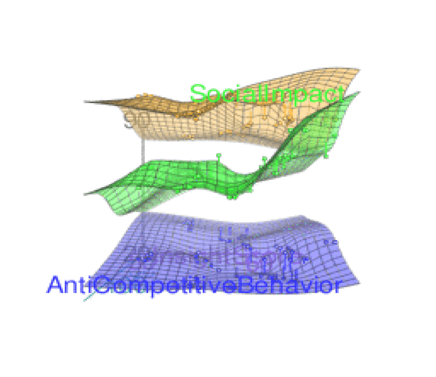
3D representation of the plotted data with Math Lab and R
IDEATION PROCESS
DESIGNING THE GET STARTED AND ANALYTICS EXPERIENCE
After the discovery and research phase I started sketching some initial thoughts, including:
- create a space for the financial analyst to generate, edit and compare portfolios with the help of the insight 360 algorithm.
- Add more analytics: creating a predictive infrastructure to allow in depth analysis of data in the past, present and in the future
- Add qualitative reports with similar framework of the magic quadrant and the Hype cycle
- Experimenting with insight 360 look and feel
- Create a storyboard for the "get start" interaction flow. Including:
- landing page integration
- set of questions to identify financial analyst/ investors risk comfort zone and assessments
- tool-kit of interactions to make it easy to customize portfolios and values ( investment goal setting, portfolio comparison , risk sliders)
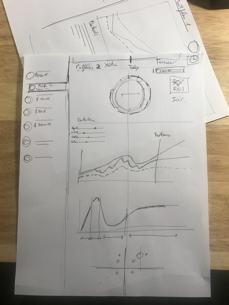
High level sketches and visualizations:
|
|
Early sketches
|
|
|
REFERENCES
Software Applications:
BETTERMENT
www.betterment.com
INTELLIGENT PORTFOLIO
www.intelligent.schwab.com
VIAFOUR
www.viafour.com
WEALTHFRONT
www.wealthfront.com
EARTHFOLIO
www.earthfolio.net
Research Methodologies:
HYPE CYCLE
http://www.gartner.com/technology/research/methodologies/hype-cycle.jsp
MAGIC QUADRANT
http://www.gartner.com/technology/research/methodologies/research_mq.jsp
INSPIRING COLLABORATORS
Mark Tse ( Data Artist)
Teresa Filshtein ( Insight analyst)
Caleb Cliff ( Holistic advisor)
Teresa Filshtein ( Insight analyst)
Caleb Cliff ( Holistic advisor)
NO SCREEN INTERFACES
productions
productions